
I still remember the first time I designed an outdoor banner. I was so proud to see it hanging in a prime spot downtown. But my excitement turned to disappointment when I noticed something: people weren’t looking at it.
Drivers passed by without a glance, and pedestrians seemed more interested in their phones. That’s when I realised - I made some classic design mistakes that cost me attention and impact.
Sound familiar? Let’s make sure this doesn’t happen to you. Here are five mistakes to avoid when designing outdoor banners, along with tips to make yours stand out.
1. Overloading with Text
What Goes Wrong:
Too much text is the quickest way to ruin an outdoor banner. Let’s face it - no one is stopping to read a novel on a banner.
Outdoor advertisements need to hit hard, fast, and clearly. If viewers can’t get the message in seconds, your design fails.
Why It Matters:
Did you know? Digital signage, similar in purpose to outdoor banners, has just 1.5 to 3 seconds to grab attention.
This means your banner has even less time to convey its message, especially to people walking or driving by. If your text is cluttered, they’ll look away before you even say “SALE.”
How to Fix It:
- Cut the fluff: Keep your headline short and impactful.
- Highlight action: Use a single, clear call-to-action (CTA).
- Guide the eye: Leverage white space to frame your message.
Example: Forget lines like, "Visit our store this weekend for incredible deals on all products!" Instead, make it punchy:
“WEEKEND SALE: Up to 50% Off!”
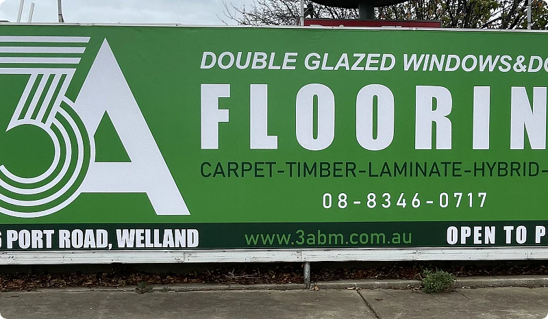
2. Ignoring Readability and Visibility
What Happens:
Ever seen a banner and squinted, trying to figure out what it says?
That’s what happens when fonts are too small, colors blend into each other, or there’s no contrast. If your banner can’t be read at a glance, it might as well not exist.
Why It Matters: A Nielsen Norman Group study found that legibility directly impacts the effectiveness of signage, as most people won’t engage with text they can’t quickly read.
How to Fix It:
- Use bold, sans-serif fonts for maximum clarity.
- Choose high-contrast color combinations like black text on a yellow background.
- Test your banner from 10, 20, and 30 feet away to ensure readability.
Example:
Replace intricate fonts like script or cursive with simple, bold options such as Arial or Helvetica.
Want to learn more about font selection for outdoor banners?
Check out this blog for a deeper understanding of choosing the right font that ensures readability and impact.
3. Neglecting Weather Resistance
What Happens:
Outdoor banners take a beating from the elements - rain, wind, harsh sun, you name it.
Without proper design considerations, they can fade, tear, or warp in no time, turning your investment into a soggy disappointment.
Why It Matters:
Durability isn’t optional for outdoor banners. According to research by the Printing Industries of America, using weather-resistant materials can increase the lifespan of outdoor banners by up to 40%, saving businesses money while maintaining a professional appearance.
How to Fix It:
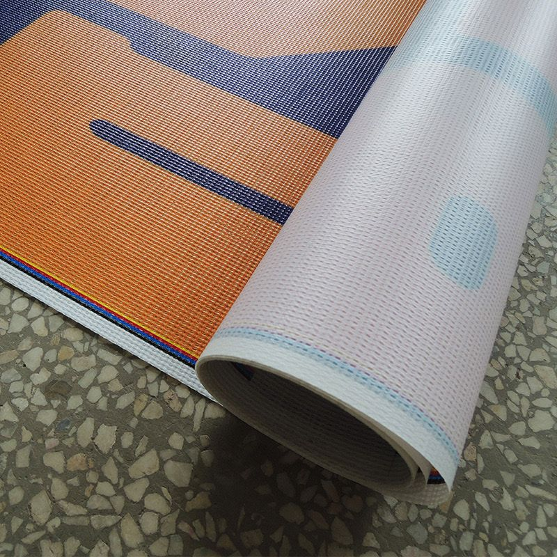
- Opt for durable materials like vinyl or mesh.
- Use UV-resistant inks to prevent fading in sunlight.
- Reinforce edges with grommets and wind slits to withstand harsh conditions.
Example:
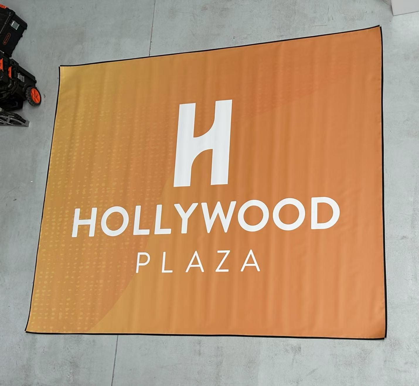
Imagine your banner displayed on a windy street corner. A basic fabric banner would likely tear or sag within days, but our Outdoor Vinyl Banner, proudly made in Australia from heavy-duty 510gsm material, is built to last.
Designed to withstand even the harshest outdoor conditions, they feature reinforced edges and optional wind slits for extra durability.
4. Designing Without Considering Placement
What Happens:
“A good banner in the wrong location is like shouting into the wind - no one notices.”
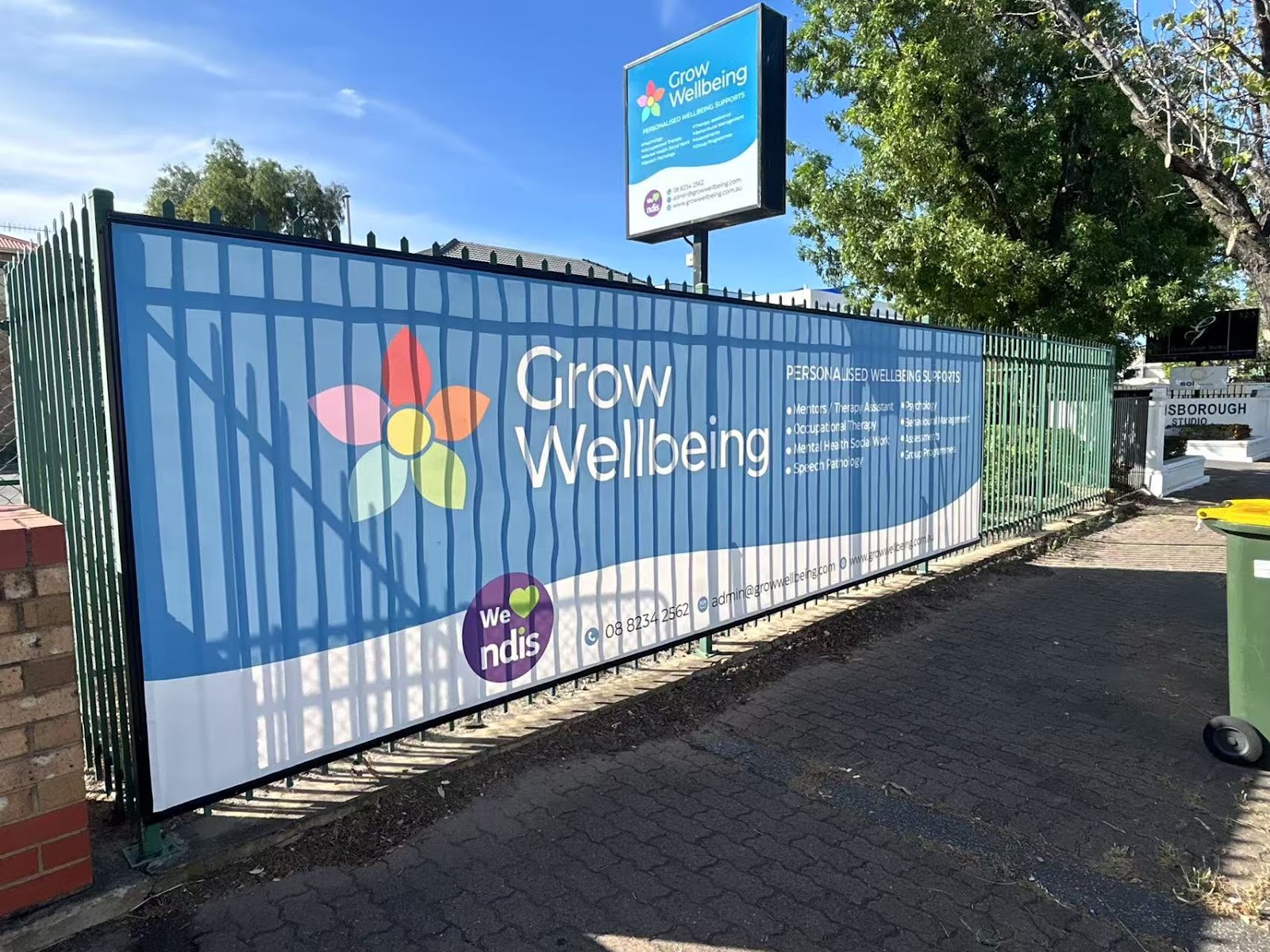
If your design doesn’t align with its placement, you’re wasting valuable time and resources. For example, a busy roadside banner with small, detailed text won’t get a second look, while an overly simple event banner may not deliver enough information.
Why It Matters:
Placement isn’t just about where your banner goes—it’s about how people see it. Roadside banners need bold, oversized fonts to grab attention instantly.
Event outdoor banners With Keder Edge, on the other hand, can include smaller details because viewers are closer and have time to engage. Ignoring placement is a surefire way to lose impact.
How to Fix It:
- Think About Distance: Adjust font size, layout, and imagery based on how far away viewers will be.
- Mock It Up: Create a visual mockup to see how your design looks in its intended spot.
- Adapt to the Setting: Use vertical layouts for high-hanging banners and horizontal layouts for eye-level displays.
Example:
Picture an outdoor vinyl banner along a highway. To stand out, it should say something like
“SALE: 50% OFF This Weekend”
in big, bold letters with minimal design. For a trade show booth, you can include smaller fonts, product images, and extra details because the audience is up close.
5. Skipping a Clear Call-to-Action (CTA)
What Happens:
Think about it - what’s the point of a banner if your audience doesn’t know what to do next?
A banner without a clear and compelling call-to-action (CTA) leaves viewers confused or uninterested, wasting all your hard work.
Why It Matters:
A study by HubSpot revealed that clear CTAs boost engagement rates by over 121%, proving how vital they are to driving action. A great design grabs attention, but a well-placed CTA is what converts that attention into results.
How to Fix It:
- Be Direct: Use action-oriented phrases like “Shop Now,” “Call Today.”
- Highlight the CTA: Make it the focal point of your design - bold fonts and contrasting colors work wonders.
- Align with Your Goals: Ensure your CTA matches your campaign’s purpose. Are you driving traffic to your website? Encouraging phone inquiries? Be specific.
Example:
Avoid vague phrases like “Learn More.” Instead, match the CTA to the banner’s context. For outdoor banners, action-oriented phrases that are quick and easy to remember work best, such as:
- “Call Now: 1800 123 456” for immediate inquiries.
- “Visit Us at [Physical Address]” to drive foot traffic.
- “Scan Here to Learn More” with a QR code to seamlessly connect viewers to your website.
Why It Works:
Outdoor viewers typically have limited time to engage, so your CTA must be simple, direct, and memorable.
Including a phone number, physical address, or QR code ensures they can act without needing to remember complex details or URLs.
Bonus Tips for Effective Outdoor Banners
01. Don’t Settle for Blurry Graphics
Nothing screams “unprofessional” like pixelated images. Use high-resolution visuals and vector logos to keep your banner sharp and striking, no matter the size.
Want pro-level results? Learn how to maximise your prints with large-format printing.
02. Make Your Branding Unmistakable
Your banner isn’t just a sign - it’s part of your brand’s identity. Stick to your signature colours, fonts, and logo to ensure your audience knows exactly who you are at a glance.
03. Test It Like a Pro
Think your design looks great? Put it to the test! Use mockups or print previews to see how it’ll perform in the real world. Catching mistakes now saves you time, money, and embarrassment later.
Conclusion
A great outdoor banner isn’t just something people notice - it’s something they remember.
When you focus on avoiding these common mistakes and designing with purpose, you create banners that don’t just look good but deliver real results.
Don’t leave your banner’s impact to chance. Colour Signs’ Custom Banners are made to grab attention and thrive in any setting.
Let’s bring your vision to life.